

Designing CTAs for higher conversions
Introduction
When it comes to boosting conversions, designing effective call-to-action (CTA) buttons is crucial. CTAs are the gateways that guide users toward completing desired actions on your website. Whether it’s signing up for a newsletter, making a purchase, or downloading an eBook, a well-designed CTA can significantly improve your conversion rate. Utilizing a professional UI design service can ensure your CTAs are visually appealing, strategically placed, and optimized for maximum performance. In this blog, we’ll explore everything you need to know about CTAs—from understanding their importance to designing them for optimal results.
Understanding CTAs
- What is a CTA?
A call to action (CTA) is a prompt on a webpage that tells the user to take some specified action. It is typically written as a command or action phrase, such as “Sign Up,” “Buy Now,” or “Learn More.” Effective CTAs are clear, concise, and compelling, driving users to engage with your content or service. - Different Types of CTAs
There are various types of CTAs, each serving a different purpose in the user journey.
Some common ones include:- Buttons: The most common form, usually placed in strategic locations.
- Text Links: Often embedded within a blog post or content.
- Forms: Used for sign-ups, surveys, or downloads.
- Pop-ups: Attention-grabbing CTAs that appear based on user behavior.
The Role of CTAs in Conversions
How CTAs Drive User Actions
CTAs are essential in guiding user behavior. They act as signposts on the user journey, providing a clear next step and reducing cognitive load. By offering a specific action, CTAs make it easier for users to proceed, thereby streamlining their experience on your website. Let’s delve deeper into how well-placed and well-designed CTAs can significantly influence a user’s decision to convert.
- Guiding User Behavior : Imagine navigating a website without any CTAs. It would be like walking through a store without signs, not knowing where to go next. CTAs eliminate this confusion by providing direction. Whether it’s a “Learn More” button after a product description or a “Sign Up Now” link at the end of a blog post, CTAs guide users towards the next logical step, making their journey intuitive and seamless.
- Reducing Cognitive Load: When users land on a page, they subconsciously ask, “What should I do next?” A clear CTA answers this question immediately, saving users from the mental effort of figuring it out themselves. This simplicity keeps users engaged and prevents them from feeling overwhelmed or lost.
- Creating a Sense of Urgency: A well-crafted CTA not only tells users what to do but also encourages them to do it promptly. Phrases like “Get Started Today” or “Limited Time Offer” create a sense of urgency, nudging users to take action sooner rather than later. This urgency can be a powerful motivator, particularly in scenarios involving sales or time-sensitive offers.
- Building Trust and Credibility: Consistent and clear CTAs also build trust with your audience. When users know what to expect and can easily navigate your site, they develop a sense of reliability and professionalism about your brand. Trustworthy CTAs are transparent about what will happen next, whether it’s leading to a form, downloading a resource, or making a purchase. This transparency reassures users and reduces any hesitation they might have.
- Personalizing the User Experience: Effective CTAs can be tailored to different stages of the user journey. For first-time visitors, a CTA might invite them to learn more about your services. For returning users, it might encourage them to sign up for a newsletter or make a purchase. This personalization makes the CTA more relevant and engaging, increasing the likelihood of conversion.
- Maximizing Conversion Opportunities: Every page on your website represents an opportunity to convert a visitor into a customer. CTAs maximize these opportunities by prompting users to take specific actions that align with your business goals. Whether it’s gathering leads, making sales, or encouraging social shares, each CTA plays a crucial role in your conversion rate optimization (CRO) strategy.
- Examples of High-Converting CTAs

- Dropbox: “Find your plan” – Simple, clear, and action-oriented.

- Netflix: “Join Free for a Month” – Creates a sense of urgency and value.

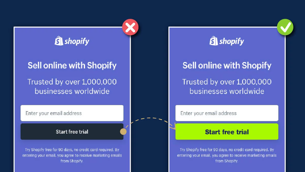
- Shopify: “Start Free Trial” – Encourages immediate action with minimal commitment.
- Dropbox: “Find your plan” – Simple, clear, and action-oriented.


Principles of Effective CTA Design
- Clarity and Simplicity
Your CTA should be easily understood at a glance. Avoid jargon and keep the language straightforward. The simpler and clearer your CTA, the more likely users are to click it. - Action-Oriented Language
Use verbs that convey action and encourage users to take the next step. Phrases like “Download Now,” “Get Started,” or “Subscribe Today” are effective because they clearly state what the user should do.
Placement of CTAs
- Above the Fold vs. Below the Fold
The debate on whether CTAs should be placed above or below the fold depends on the context. For highly compelling offers, above the fold can grab immediate attention. For more complex decisions, placing CTAs below the fold allows users to absorb information before taking action. - Strategic CTA Placement
Consider the user journey when placing CTAs. Position them at natural stopping points where users are ready to make a decision. For instance, placing a CTA at the end of a product description or after a compelling testimonial can be highly effective.
Visual Design of CTAs
- Color and Contrast
The color of your CTA should stand out from the rest of your page. High contrast between the CTA button and the background ensures it catches the user’s eye. Complementary colors that align with your brand but still pop are ideal. - Size and Shape
CTAs should be large enough to notice but not so large that they overshadow the content. The shape can also affect visibility—rounded corners often perform better than sharp edges as they draw attention.
CTA Copywriting Tips
- Crafting Persuasive Copy
Your CTA copy should resonate with user intent and needs. Highlight the benefits of clicking the CTA rather than just the action itself. For example, “Get Your Free eBook” is more enticing than “Download Now.”
- The Power of Urgency and Scarcity
Creating a sense of urgency or scarcity can drive immediate action. Phrases like “Limited Time Offer” or “Only a Few Left” can make users feel the need to act quickly.
Using A/B Testing for CTA Optimization
- Importance of A/B Testing
A/B testing allows you to compare different versions of your CTA to see which performs better. This data-driven approach helps you make informed decisions and continually improve your CTAs.
- How to Conduct A/B Tests for CTAs
- Identify Variables: Decide which elements to test—color, text, placement, etc.
- Create Variations: Develop different versions of your CTA.
- Run the Test: Split your audience and show each group a different version.
- Analyze Results: Determine which version had higher conversions and implement the findings.
Common CTA Mistakes to Avoid
- Overloading Users with CTAs: Too many CTAs can overwhelm users and reduce the effectiveness of each one. Focus on one primary CTA per page to guide users clearly towards the desired action.
- Vague or Weak Call-to-Actions: CTAs that are not specific or compelling fail to drive action. Ensure your CTAs are direct and emphasize the benefit of taking action.
Analyzing CTA Performance
- Key Metrics to Track
To gauge the effectiveness of your CTAs, track metrics such as click-through rates (CTR), conversion rates, and bounce rates. These indicators provide insights into how well your CTAs are performing.
- Tools for Measuring CTA Success
Several tools can help you measure CTA performance, including Google Analytics, Hotjar, and A/B testing software like Optimizely. These tools offer detailed data to refine and optimize your CTAs continuously.
Conclusion
Designing effective call-to-action (CTA) buttons is a cornerstone of successful conversion rate optimization (CRO). By understanding user intent and strategically placing CTAs throughout the user journey, you can significantly boost your conversions. It’s not just about adding a button; it’s about creating a seamless path for your users that aligns with their needs and motivations.
A well-crafted CTA can make all the difference in guiding users toward taking the desired action. Whether you’re working with a top-tier UI UX design company like onething design or any other reputable design agency, focusing on designing CTAs with clarity, urgency, and strategic placement will yield substantial results.